The TAOMA Brand: body, balance & wellness
Creating the clinic’s image from the ground up
TAOMA is a new Physiotherapy center in Valencia in which different types of treatments are unified, adapted to the needs of each patient.
We embarked on the project from the beginning, helping them define the clinic’s corporate identity and integrate it into its entire brand ecosystem: logo, colors, space, graphic elements and the website.
Client
TAOMAServices
Web Design
Web Development
Brand Strategy
Share

The human body as an essential nexus: the link to everything
The name and identity revolve around the conceptualization of the human body. For this reason, the logo presents three elements that symbolize the head, torso and legs of a person, which converge with the simplicity, tranquility and order of the oriental style.
In this way, TAOMA represents the balance between physiotherapy and traditional Chinese medicine as techniques that combine efforts to achieve a healthy and harmonious body.


Well thought-out, personalized illustrations
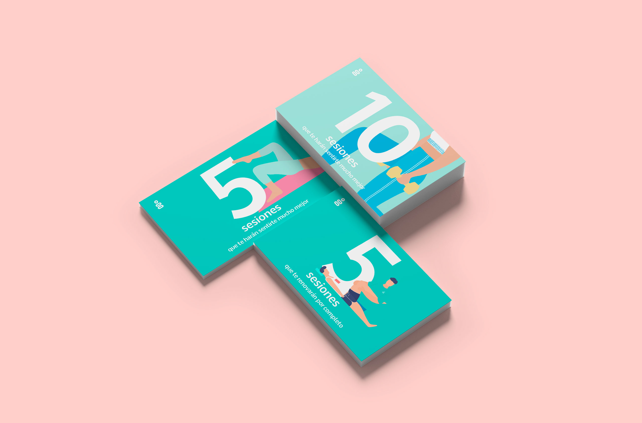
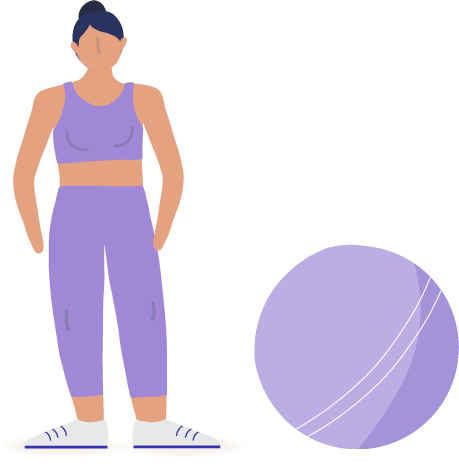
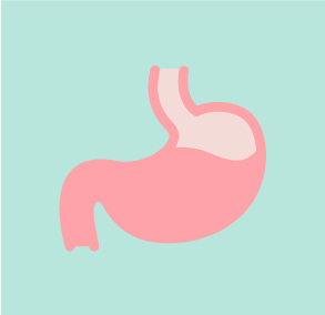
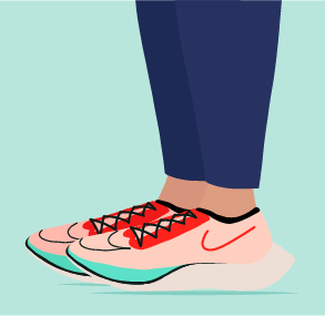
Based on the brand’s Zen personality and the importance of physiognomy, we created personalized illustrations that show the different parts of the body.
These drawings appear applied on the website and on other corporate elements, such as social media creatives, helping to maintain a consistent image across all channels.






A functional website that zeroes in on what matters
The web is simple and intuitive, and offers an enjoyable user experience. Its goals are clear: attract customers, make them feel comfortable, provide information on services and allow them to book their visit completely online.
Always retaining visual coherence, with design details that make it special and highlighting the most important value of TAOMA: its team. The images, structure and copy highlight the knowledge, trajectory and closeness of the professionals who work in the clinic.

