AMAI TLP’s new image, a rainbow emerging from the storm clouds
A total change of image
The AMAI TLP foundation decided to change its image. They wanted to adapt to the new trends and celebrate their 20th anniversary with a renewed brand. Thus began a rebranding process in which research was essential to understand their role and the disease they work for and translate it into a brand adapted to today, but which preserves its essence, values and trajectory.
Client
AMAI TLPServices
Branding
Editoria Design
Share

A look inside the AMAI TLP Foundation
AMAI TLP is a Madrid-based Foundation that helps to research BPD (Borderline Personality Disorder). A poorly diagnosed disease that consists of a persistent pattern of affective instability and that, unlike other mental illnesses, is quite unknown in society.
The foundation focuses both on patients and on helping their families, becoming a space in which they find the understanding, the means and the empathy so difficult to find in our wider society.
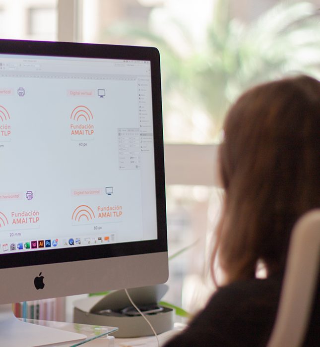
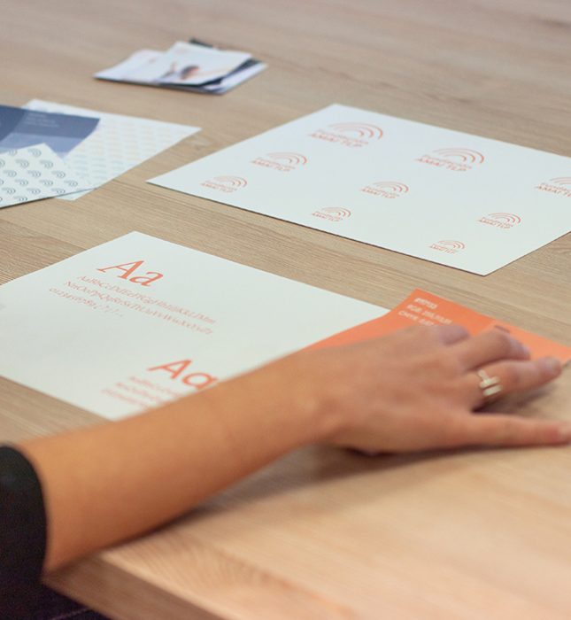
The goal: a brand with personality, synchronized with its work
In 2020, the foundation will be 20 years old from its birth. Two centuries of work, support and awareness that they wanted to celebrate by renewing their corporate identity.
Since its inception, the image of AMAI TLP had remained intact, requiring an update process in accordance with the level that the foundation had reached in all those years. They wanted to turn her into an image with personality and in tune with her character. A gesture to recognize the work of all those who participate in the project and increase their visibility to continue growing.

Let’s check out the rebranding phases, step-by-step
We wanted to know what the foundation represented to them. A shelter for people with BPD and their families: support, empathy and understanding.
An essential information to be able to represent the TLP and the work of the foundation through the corporate identity of AMAI TLP.
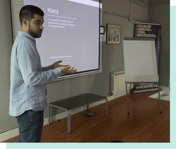
Using the findings of the first meeting as a basis, we conducted an in-depth industry research, which led us to learn about how other companies communicate and represent BPD and mental illness.
We draw on national and international references, we investigate other disorders related to BPD and classify all the information at a communicative, graphic and conceptual level. Among the main characteristic features of the identity of other companies related to the vision of AMAI TLP, we highlighted the use of imperfect elements, the application of cheerful colors and the use of organic shapes.
The foundations on which to start building the new brand
We looked for words that would evoke what AMAI TLP is: hope, connection, family and we found in the rainbow the way to represent them in a tangible image.

Reflecting on the balance between a rich track record and the looking to the future
From the perspective of the foundation, it was extremely important to retain their identity and recognize the last 20 years of work. Adding value without losing their story.
So, we work to find that middle ground that holds onto the most important elements but adapting its image to the here and now.
AMAI TLP’s new corporate identity
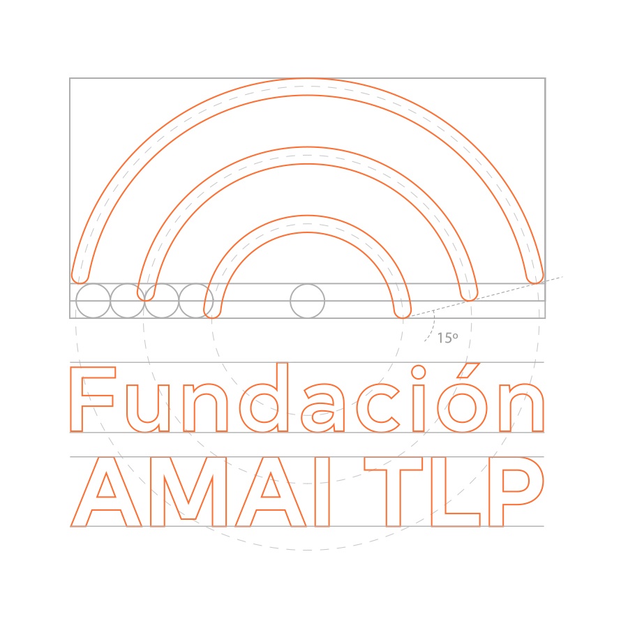
To represent AMAI TLP we rely on the three backbone axes that give meaning to its activity: the patient, the family and society.
Logo
PATIENT.
The patient features at the center of everything, getting help and support from the organization.
FAMILY.
The family, by the patient’s side, receiving support and training.
SOCIETY.
Finally, surrounding the family are professionals (psychologists and therapists who receive training) and the rest of society, who make contact with AMAI through awareness-raising actions on BPD.
Color
Like all brand redesign projects, an important part is the definition of colors, a fundamental component of corporate identity and which contributes, in an essential way, to unifying the visibility of the brand. In this case, the representation of the AMAI TLP brand in the corporate color orange is the one that best identifies the institution, and therefore it is the main color.
The corporate identity includes, in addition to the main corporate color, secondary and auxiliary colors to complement the material design.


Layout & typesetting
Impressive and full of character, but simple. With rounded geometric elements. We define a main font and an auxiliary font as a support for certain materials.
IiJjKkLlMmNn
OoPpQqRrSsTtUuVv
WwXxYyZz
IiJjKkLlMmNn
OoPpQqRrSsTtUuVv
WwXxYyZz
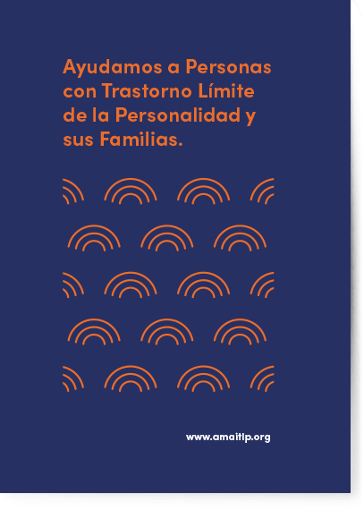
A custom created graphic element created from the logo that serves as a complement to the design for corporate materials.
The use of this graphic element will identify the AMAI TLP brand in any document or medium in which it appears and its authorship is attributed.
Illustrations
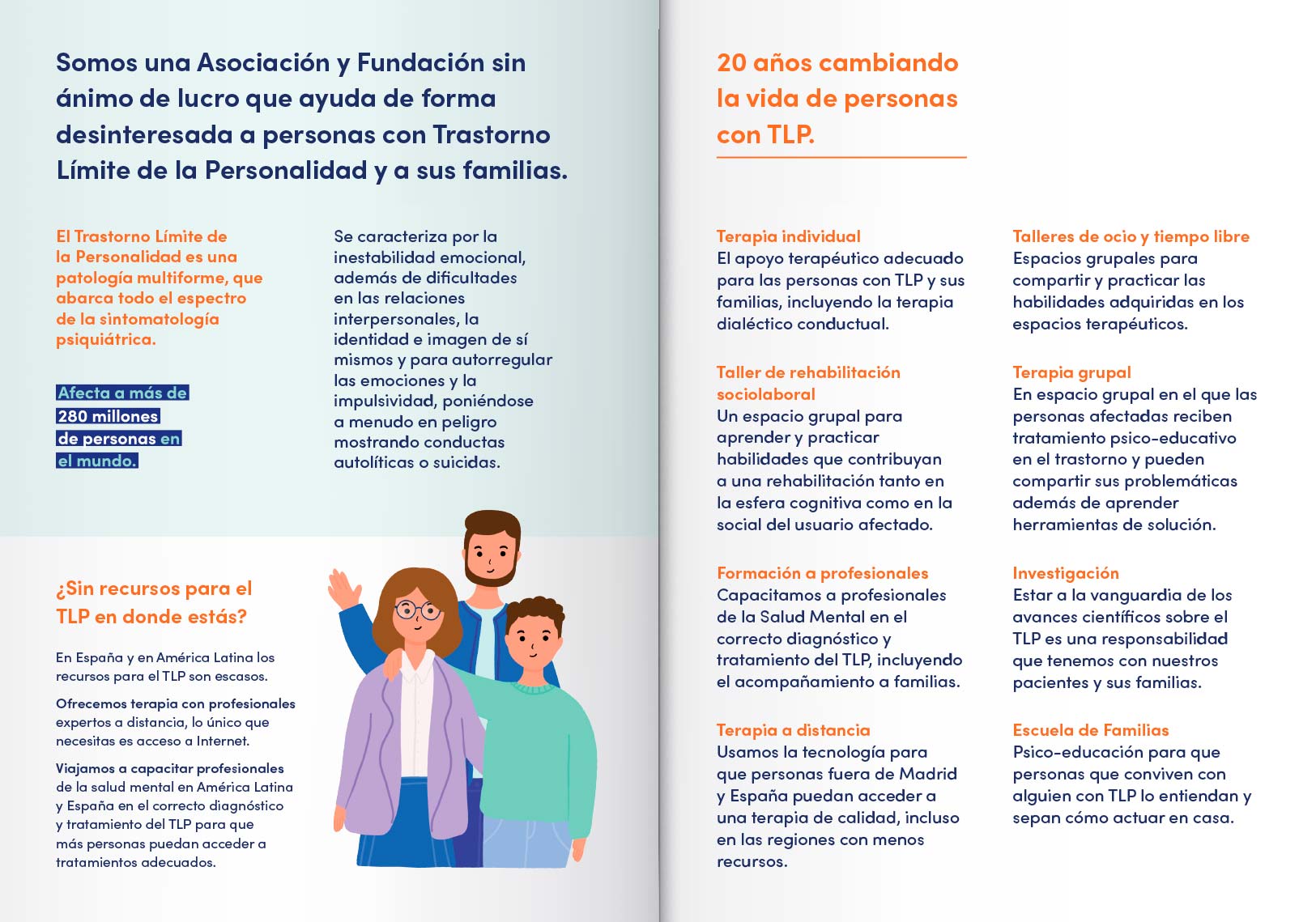
In this project, illustration design has been very present at every stage. They solve the difficulty of representing BPD with images. They allow us to reflect on situations and emotions of patients and relatives in a much more cheerful, carefree and dynamic way.


The result: something that goes far beyond a change of logo
This project has managed to preserve the identity of AMAI TLP and adapt it to the new era. With a much more modern and scalable format that has consolidated them as a company.
The attempt to honor the 20 years of the foundation has gone further, giving it its own personality through the brand and contributing to a more precise diffusion of its work and its values.
Hope.
Connection.
Family.
Showcasing the new image
The activity report has been one of the first materials where the new corporate identity has been implemented.
It is a document that summarizes all the actions that have been carried out throughout the year and the new challenges for the next.


